Visual identity
Brand guidelines - Version 1.0, 2025
Our brand typefaces, Noi Grotesk and Circular, work together to create a distinctive and cohesive visual identity across all communications. Each has specific uses within our hierarchy to ensure clarity and consistency.
Brand typography
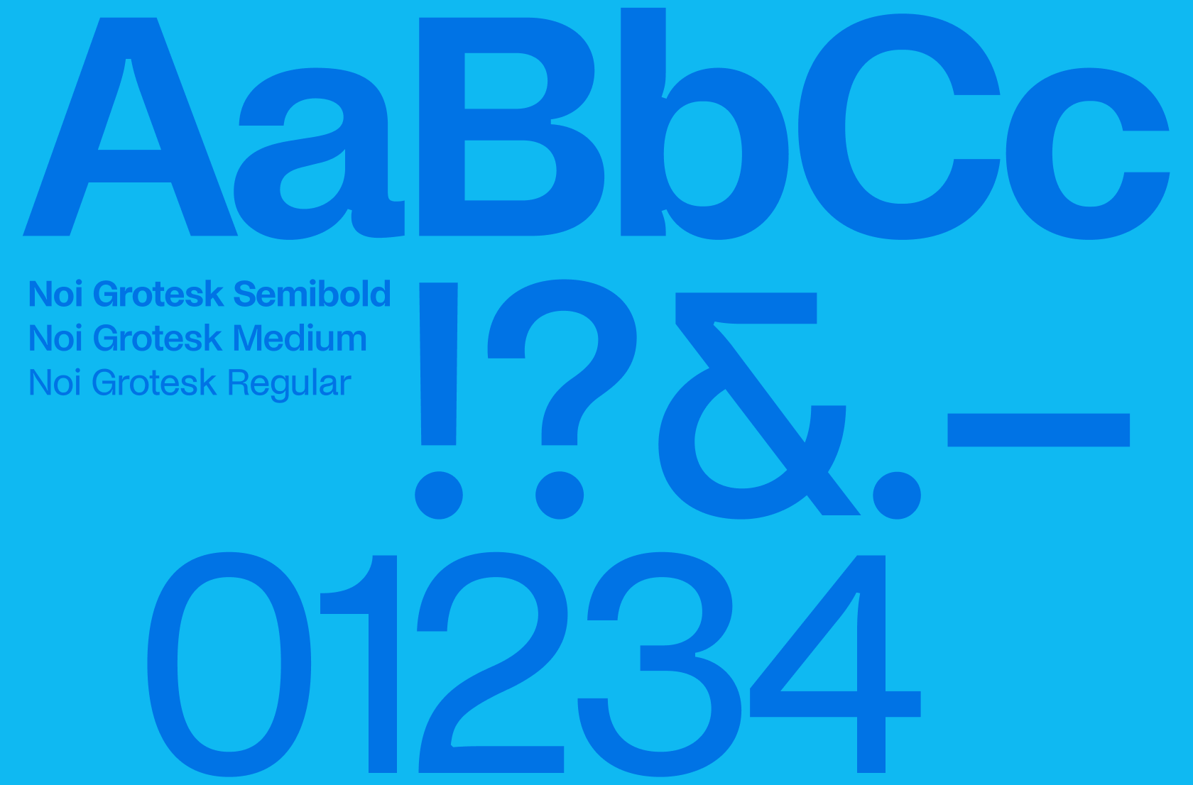
Noi Grotesk
Noi Grotesk is our display font, setting the tone for headlines and prominent text. Use Noi Grotesk Regular for headlines and titles. Semibold is reserved for campaigns, ads, and materials needing extra emphasis.
Weights in use: semibold, medium and regular.
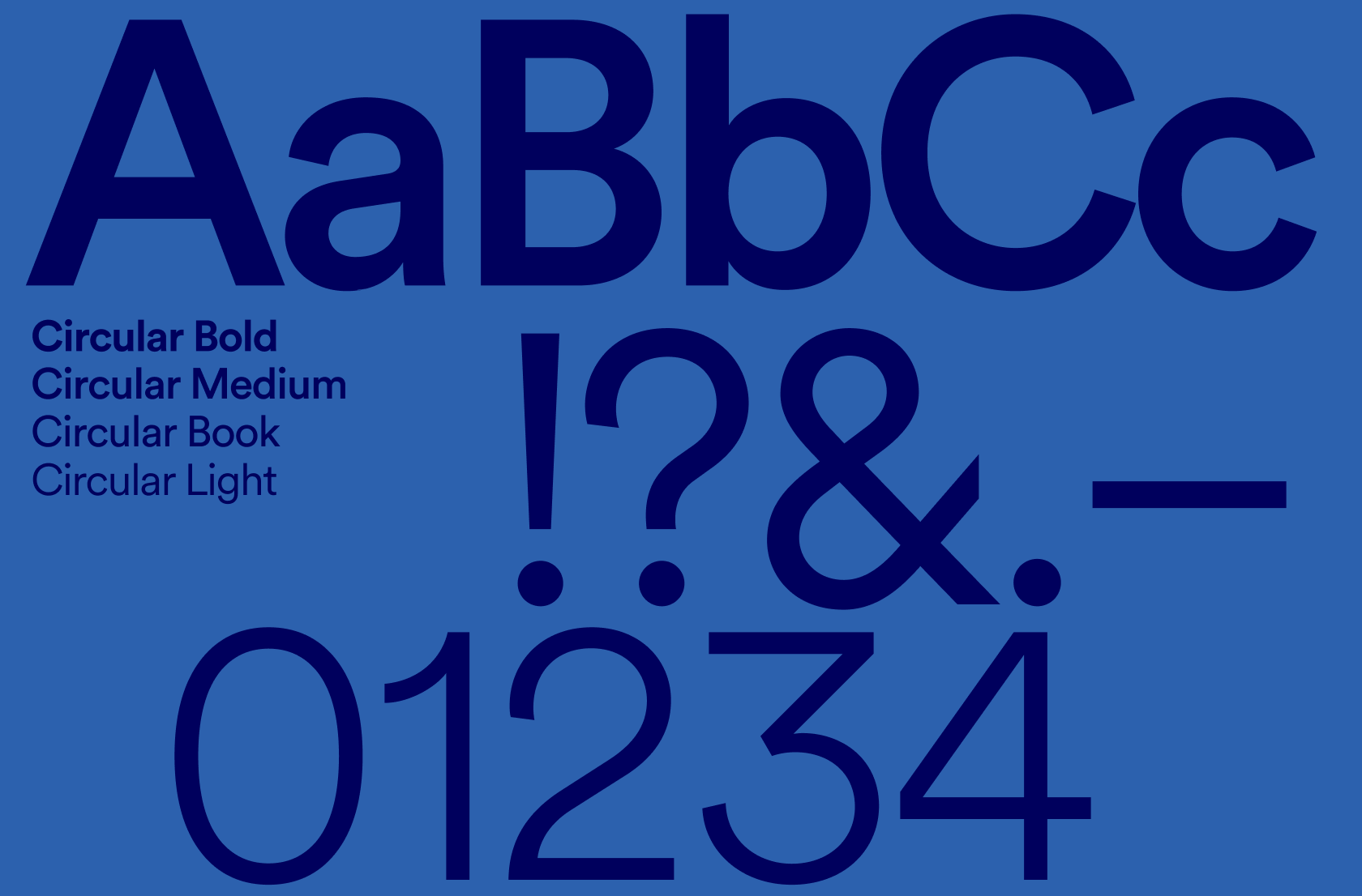
Circular
Circular is our versatile font family, primarily used for body copy and supporting text. Circular Light is the main font for body copy and introductory text. Use Circular Book for subheadings, with Medium and Bold for key points and calls to action.
Weights in use: bold, medium, book, and light.
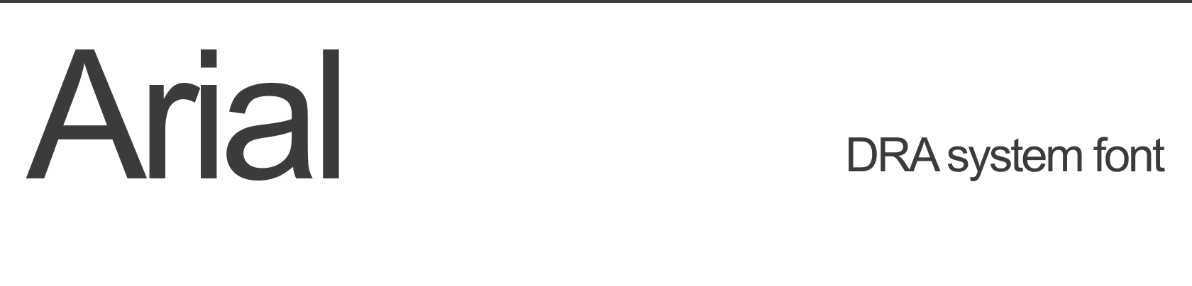
System font
Arial is our designated system typeface. It should be used for day-to-day communications and any digital content where our primary brand fonts are unavailable.
Arial ensures consistency and readability across various platforms and software, making it ideal for internal documents, presentations, and basic communications.
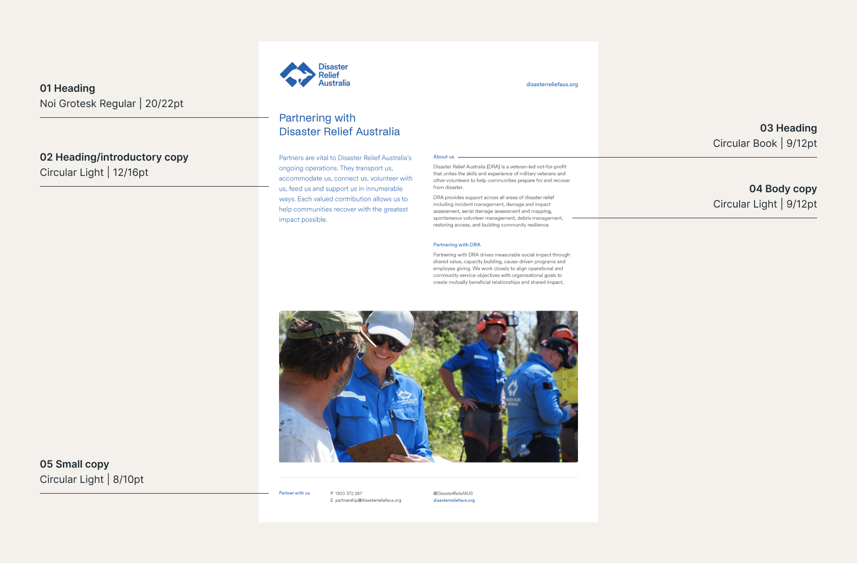
Hierarchy and colour
Use different weights and sizes of Noi Grotesk and Circular to create hierarchy across communications.
- Heading
Use for chapter or section titles. This heading is not required on every page. - Heading/introductory copy
Use to highlight a starting paragraph. - Heading
Use primarily for subheadings. - Body copy
Use for the majority of content. - Small copy
Use mainly for footers or pagination.
As a general rule, body copy should be applied in 95% black. Headlines may use DRA Blue, DRA Navy, or DRA White as appropriate. To ensure legibility, use light text on dark backgrounds and dark text on light backgrounds.
If you have any questions regarding the brand guide, please contact:
Emma Coakes
Chief Marketing & Communications Officer
E: Emma.Coakes@disasterreliefaus.org
