Visual identity
Brand guidelines - Version 1.0, 2025
Our brand uses two key graphic elements: the diamond and the topographic map.
Together, these elements reflect the strength and reach of our organisation’s impact while shaping a bold, distinctive visual identity.
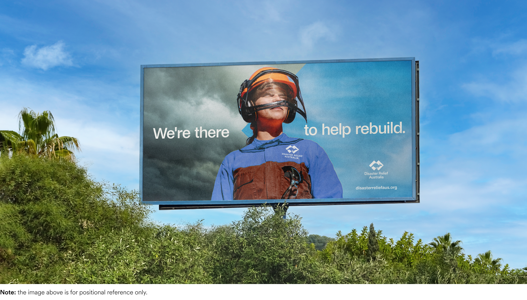
The diamond
Derived from the shapes in our brandmark, the DRA diamond is a clean and impactful element that brings focus to layouts.
Its simplicity makes it highly versatile. The diamond shape can be used to highlight important information, divide sections, or bring structure to layouts.
It also works well as a container for short headlines, logos, or other key elements. When used this way, always leave enough clear space between the content and the edges of the diamond to reduce visual clutter.
As a container, it’s particularly effective for high impact applications such as document covers, presentation slides, and event signage.

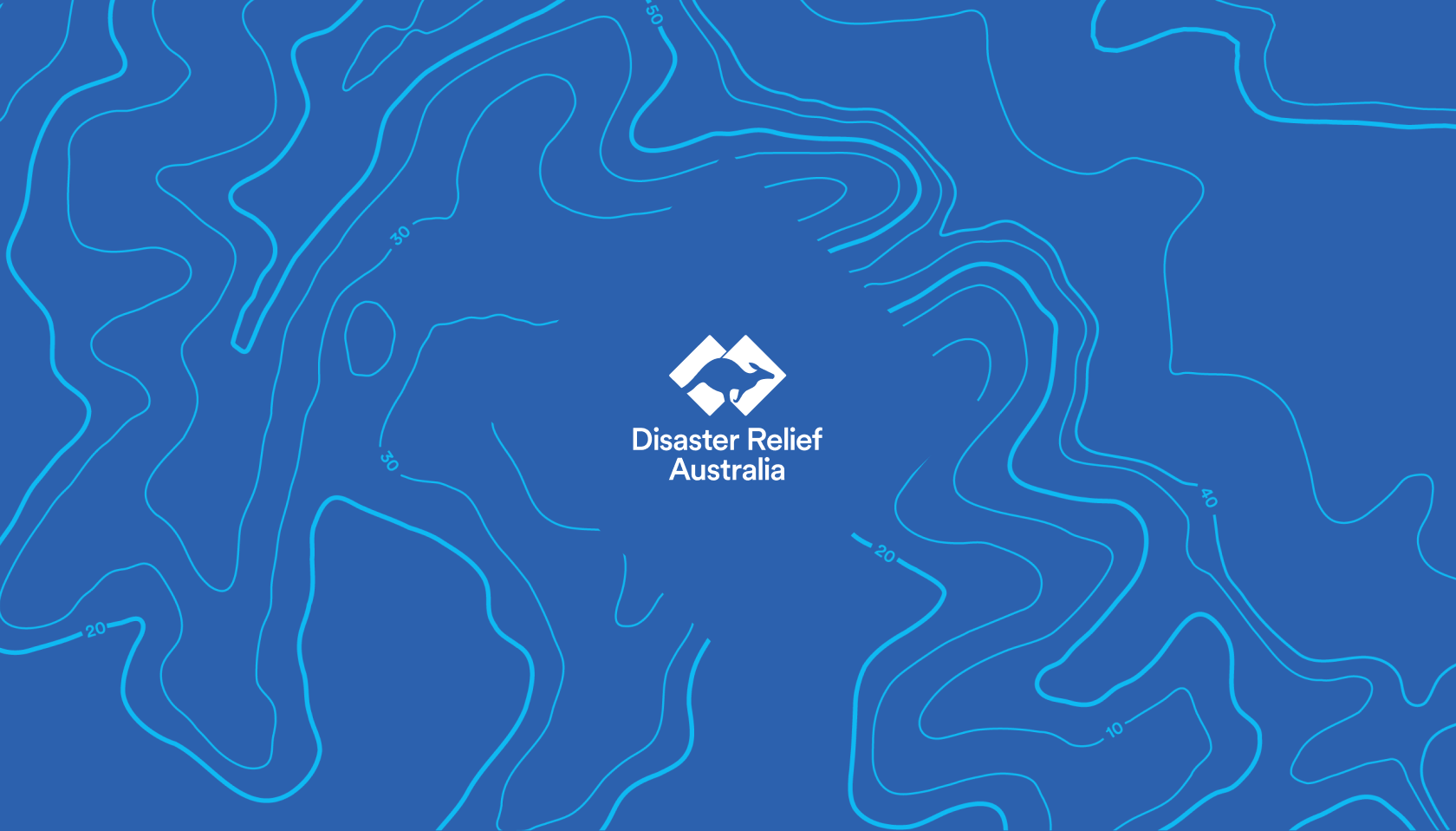
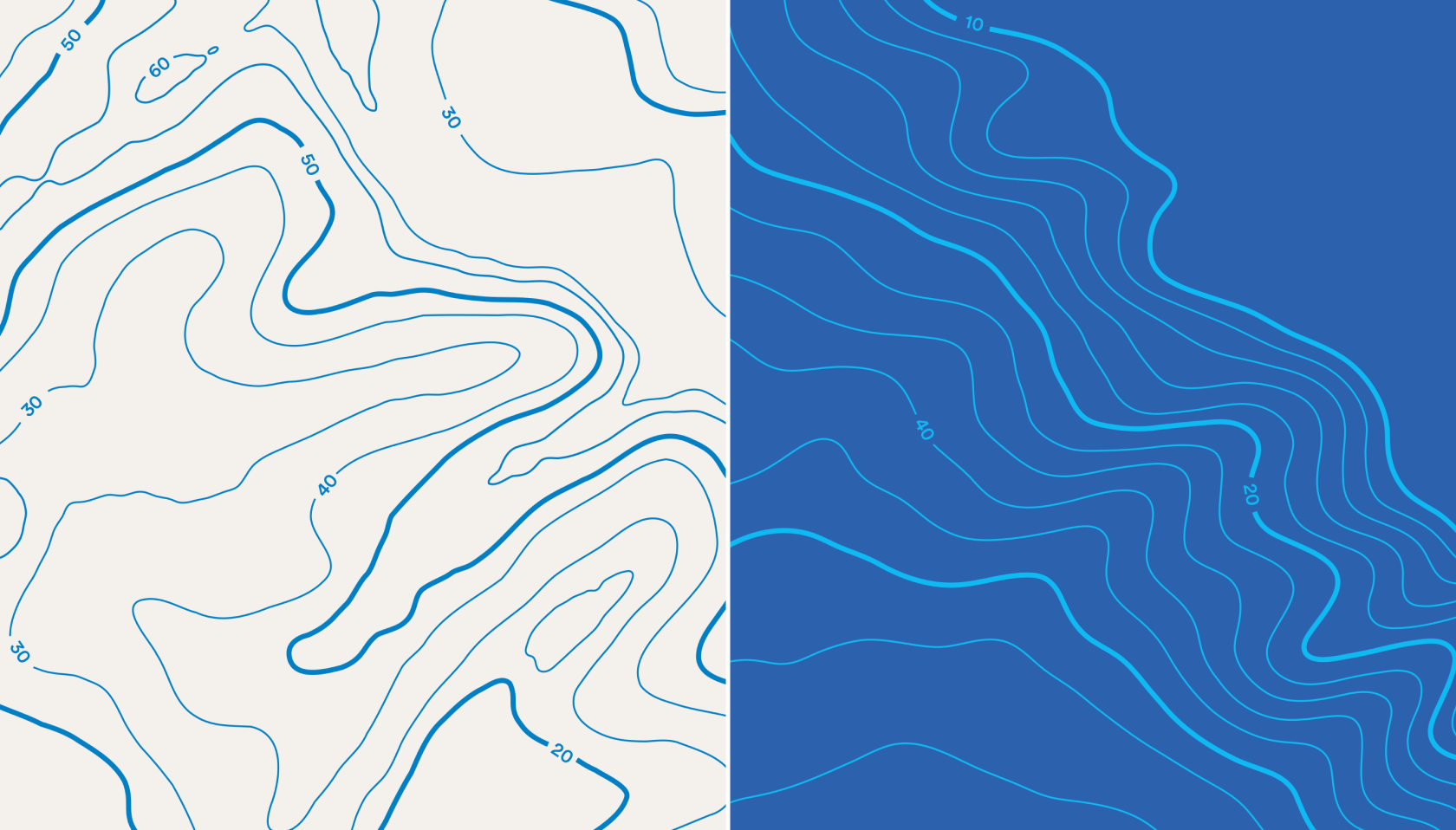
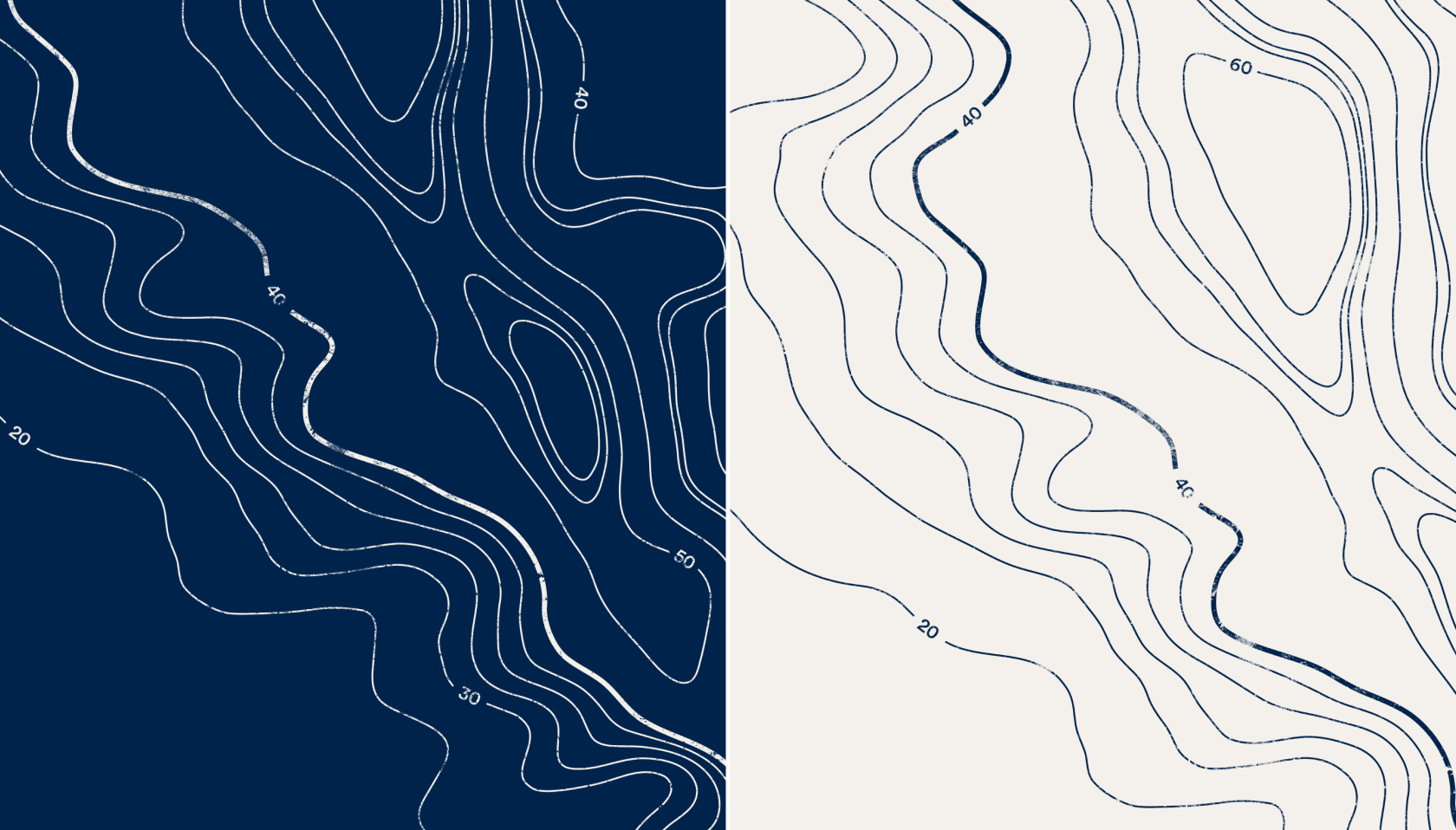
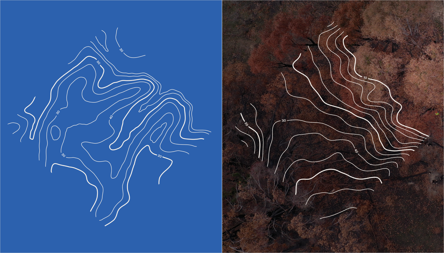
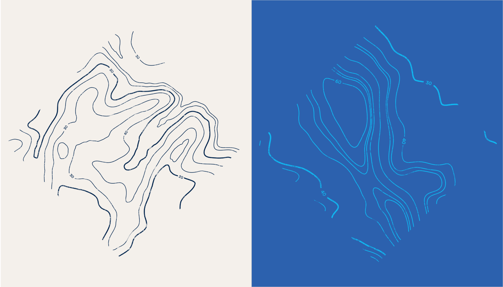
Topographic map
Drawing inspiration from DRA’s Big Map initiative, our topographic elements add depth and dimension to layouts. There are two variations of our topographic map elements:
- Clean
The clean topographic maps are optimised for digital use, offering a polished option for on-screen applications.
- Textured
The textured topographic map reflects the raw reality of disaster zones and the gritty nature of our recovery efforts. These are best suited for print applications, where the tactile quality of the texture can be fully appreciated.
Our topographic map suite includes three unique designs, each available in both clean and textured variations. These assets come in the following brand colours: DRA Natural, DRA Navy, DRA Sky, and DRA Blue. Topographic maps work well as background elements and can be overlaid on solid colours.
Diamond map
The diamond and topographic map can be used together to add variety and depth to designs. Alongside our standard topographic maps, we also have diamond-shaped topographic map graphics. These can be layered over aerial imagery or colour blocks to create visually striking designs.
This combination works particularly well for applications such as brochure covers, presentations, and other branded materials that require strong visual impact.
This suite is available in the following DRA brand colours: Natural, Navy, Sky, and Blue.
DRRT map
Each DRRT has its own unique diamond map, created to represent and distinguish it within the broader DRA brand. These maps are separate from the standard diamond map graphics and showcase the individual identity of each DRRT.
These graphics should only be used in materials directly related to the specific DRRT or in communications that reference it. They are not intended for use in general brand design or non-DRRT content.
If you have any questions regarding the brand guide, please contact:
Emma Coakes
Chief Marketing & Communications Officer
E: Emma.Coakes@disasterreliefaus.org
