Visual identity
Brand guidelines - Version 1.0, 2025
Icon style
DRA icons are designed in an outline style to ensure clarity and simplicity. They have been crafted to align with the DRA brand identity.
Access library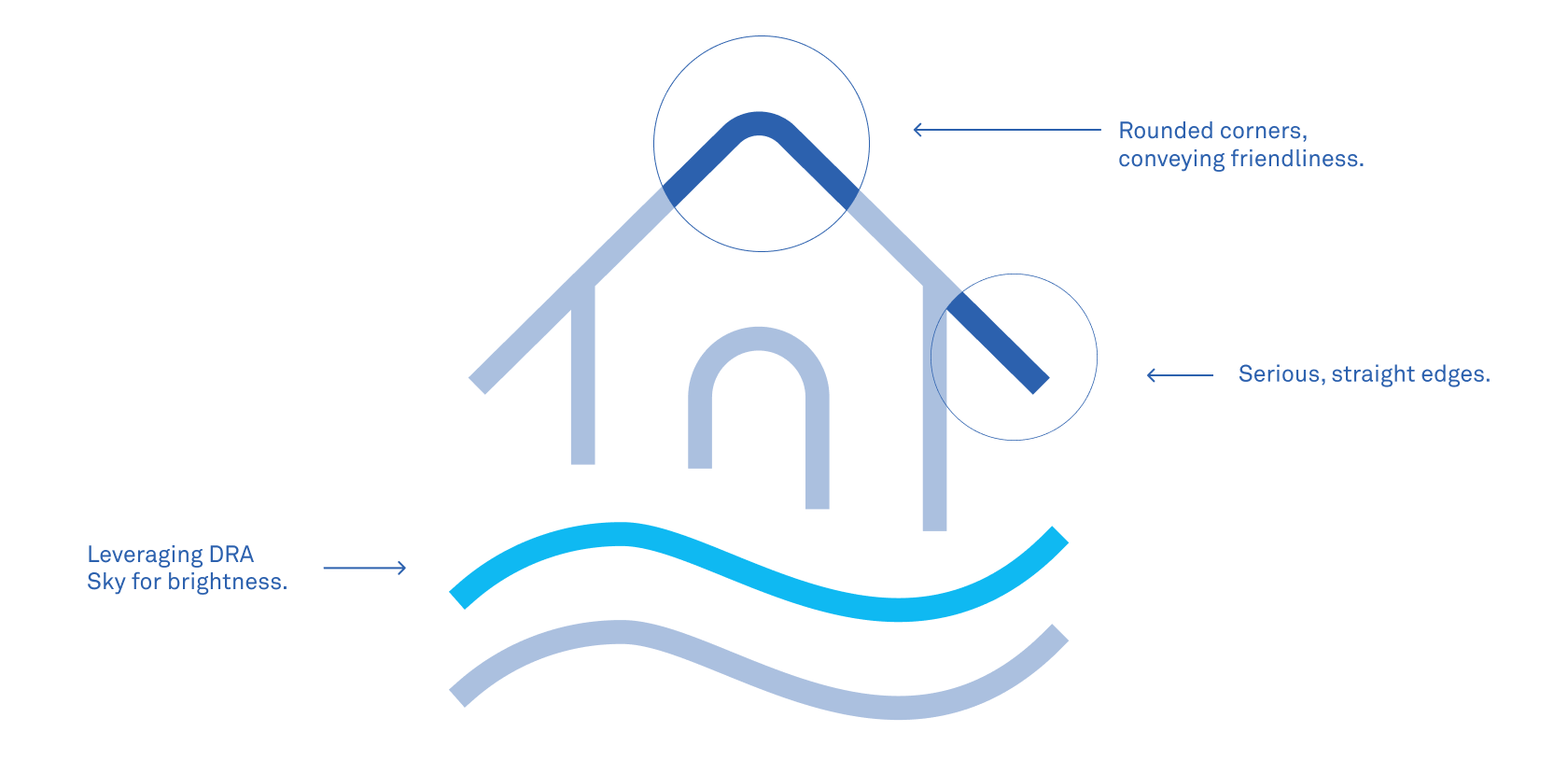
Using colour effectively
There are two colour options for the DRA icons. The preferred colour is DRA Blue, which should be used whenever it provides enough contrast. If the coloured version does not have sufficient contrast or clarity—such as on dark backgrounds or images—then the reverse colour should be used instead.
If you have any questions regarding the brand guide, please contact:
Emma Coakes
Chief Marketing & Communications Officer
E: Emma.Coakes@disasterreliefaus.org
